
Reece Construction Company has been building good roads and bridges in Kansas for over 80 years. They wanted to update their image with a new logo that conveyed their strength and longevity, and then carry that branding into an updated website. The first slide below shows the options we designed, and the second slide is their final logo. The capital R references a ‘box culvert,’ an element they requested be incorporated in the design, since they are frequently used in Reece’s construction projects.
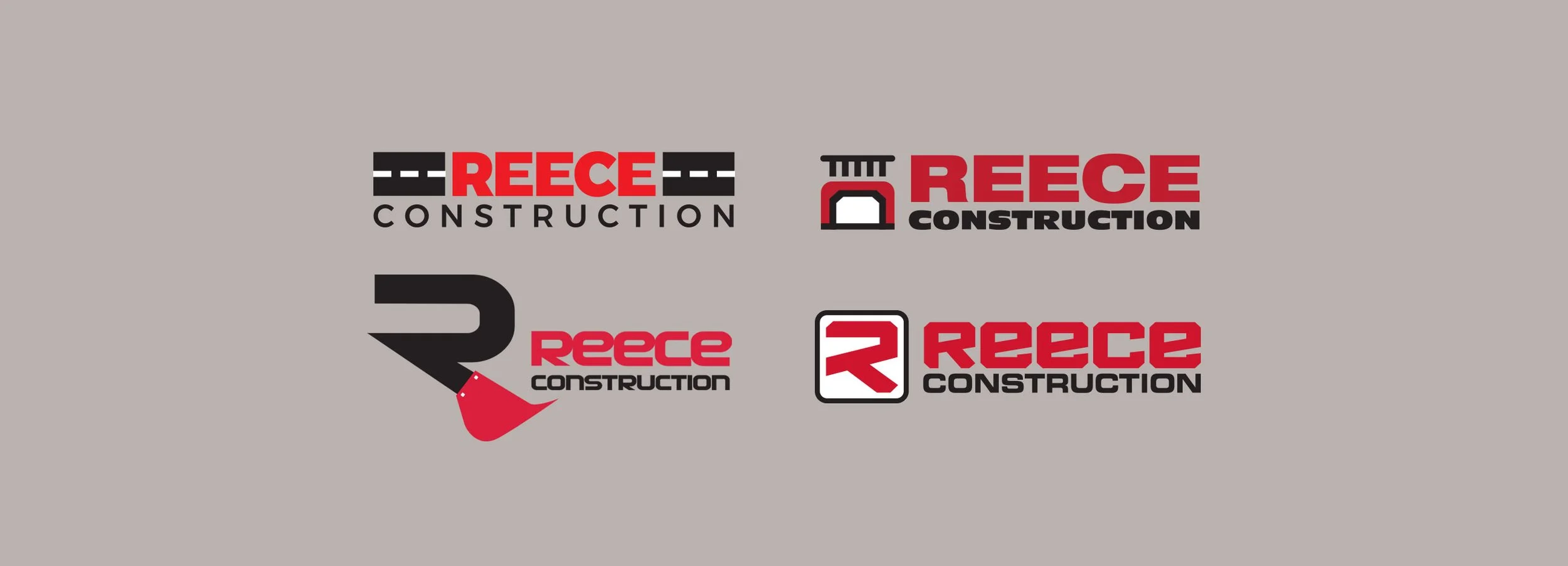
Reece Construction logo options
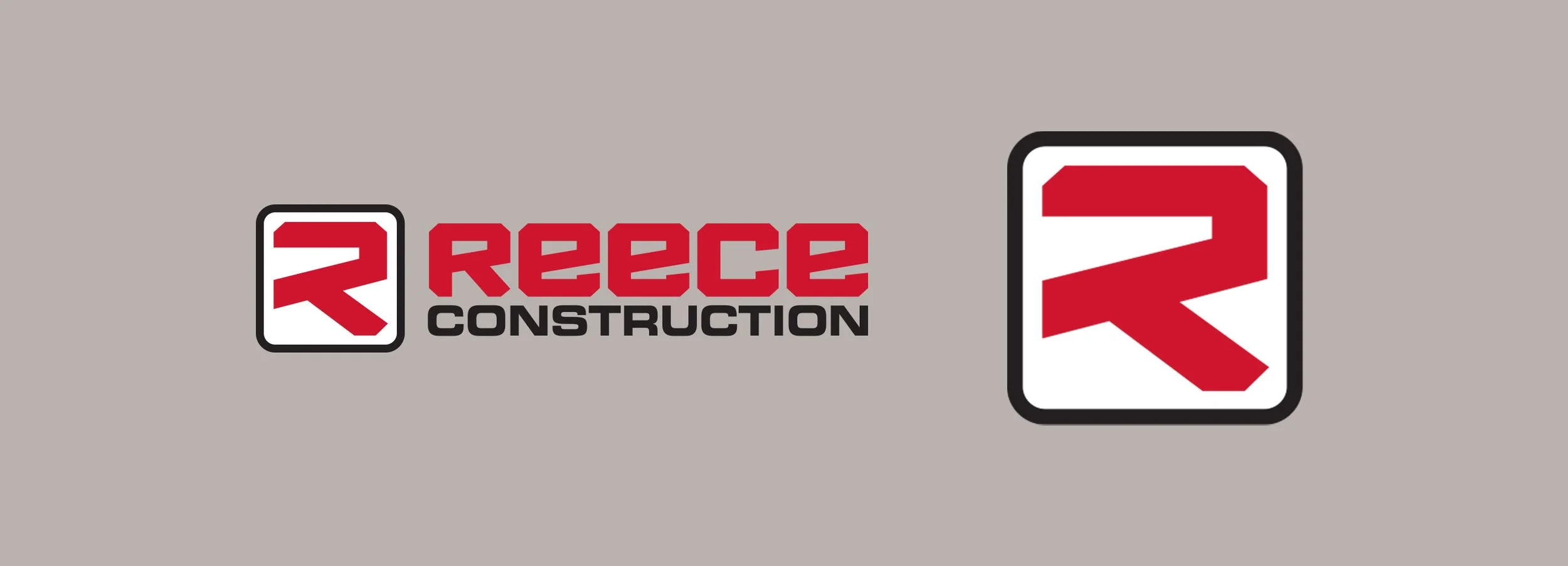
Reece Construction logo

Reece Construction website